Key Takeaways
- Optimal screen count: 3-5 screens for most apps; completion drops 10-15% per screen beyond 5
- Optimal time: Under 60 seconds to first value; 2 minutes maximum total
- The real metric: Time-to-value matters more than screen count—users forgive more screens if each feels fast
- Completion benchmarks: Average onboarding completion is just 19.2%; top performers hit 40-50%
- Testing is essential: The "right" length varies by app—Snoopr lets you A/B test different lengths instantly without code changes
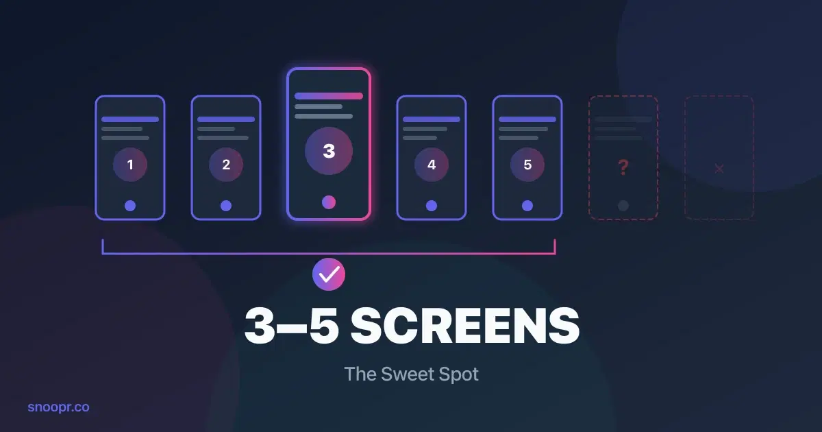
The ideal mobile app onboarding is 3-5 screens completed in under 60 seconds. Research shows that onboarding flows with more than 5 steps see completion rates drop by 10-15% per additional screen, and users who don't experience value within 60 seconds rarely return.
But here's what the generic advice won't tell you: the "right" length depends on your app category, what you're asking users to do, and whether you're measuring screens, time, or cognitive load. A 5-screen onboarding that delivers value in 45 seconds outperforms a 3-screen flow that takes 2 minutes.
This guide breaks down the data on optimal onboarding length—by screens, by time, and by what actually predicts completion. You'll learn exactly how long your onboarding should be, what to include (and cut), and how to test different lengths without waiting weeks for app store approval.
How Many Onboarding Screens Are Ideal?
3-5 screens is the sweet spot for most mobile apps. According to Pendo's onboarding research, tours with 2-4 steps maintain completion rates near 50%, while each additional step beyond 5 reduces completion by 10-15%.
Here's what the data shows:
| Screen Count | Completion Rate | Recommendation |
|---|---|---|
| 1-2 screens | 55-60% | Too short for most apps; may not communicate enough value |
| 3-4 screens | 45-50% | Optimal for simple apps with clear value props |
| 5 screens | 35-40% | Maximum for complex apps; each screen must earn its place |
| 6-8 screens | 20-30% | Only if absolutely necessary; expect significant drop-off |
| 8+ screens | <20% | Almost always too long; users abandon |
Why More Screens Kill Completion
Every screen is a decision point. Users unconsciously ask: "Is this worth my time?"
With each tap, two things happen:
1. Commitment increases — They've invested more effort
2. Patience decreases — They're closer to "this is too much"
The second effect usually wins. Business of Apps data shows the average onboarding checklist completion rate is just 19.2%—meaning 80% of users don't finish. The median is even worse: 10.1%.
The apps that beat these numbers share a common trait: ruthless prioritization. They ask: "What are the 3-4 actions absolutely essential for this user to experience value?" Everything else gets cut or moved to later.
Screen Count by App Category
Different app types can support different lengths:
| App Category | Recommended Screens | Why |
|---|---|---|
| Utility apps | 1-2 | Value is obvious; get out of the way |
| Social apps | 2-3 | Connect to friends fast; save features for later |
| Gaming | 1-3 | Let them play immediately; teach through gameplay |
| Fitness | 3-4 | Minimal profile data, then first workout |
| Fintech | 4-5 | Compliance requirements, but front-load value |
| Productivity | 3-5 | Show one "aha moment" before asking for setup |
| E-commerce | 2-3 | Personalization questions, then browsing |
Snoopr helps teams test whether their app fits these patterns. A fitness app might discover that 3 screens outperforms 5—but you won't know until you test it. With Snoopr's instant publishing, you can run that experiment in days instead of months.
How Long Should Onboarding Take? (Time Benchmarks)
Users should reach meaningful value in under 60 seconds. Total onboarding time should not exceed 2 minutes—Appcues research found that if onboarding takes longer than 2 minutes, users give up entirely.
Time-to-Value Benchmarks
| Performance Level | Time to First Value | What It Means |
|---|---|---|
| Top performers | Under 60 seconds | Users experience core benefit immediately |
| Average apps | 2-5 minutes | Most users abandon before value |
| Poor performers | 5+ minutes or never | Onboarding becomes the reason users leave |
According to Fanana's activation research, apps that achieve time-to-value under 60 seconds see 3-5x higher retention rates than those that take longer.
The 60-Second Framework
Here's how top apps structure time within onboarding:
| Time Window | What Should Happen |
|---|---|
| 0-10 seconds | App loads, first screen appears, user understands the purpose |
| 10-30 seconds | User interacts with something meaningful (not just "Next" buttons) |
| 30-60 seconds | User experiences the core value proposition |
| 60-90 seconds | Contextual guidance for next steps |
| 90-120 seconds | Optional: signup, permissions, profile (after value proven) |
Notice what's missing from the first 60 seconds: account creation, permission requests, and feature tours. Those come after value is demonstrated—if at all.
Time Per Screen
If you're targeting 60 seconds with 4 screens, each screen gets roughly 15 seconds of attention. That's not much.
Rules for fast screens:
- One idea per screen (not three bullet points)
- Headline + visual + one CTA
- No scrolling required
- Copy that can be read in 5 seconds
Snoopr's visual builder shows real-time previews on actual device dimensions, so you can see whether your screens feel fast before publishing. The AI content generation also optimizes for brevity—generating concise copy that fits mobile attention spans.
Screen Count vs. Time: Which Matters More?
Time-to-value matters more than screen count. A 5-screen onboarding that takes 45 seconds outperforms a 3-screen onboarding that takes 3 minutes.
Here's why this distinction matters:
The Screen Count Trap
Teams often optimize for fewer screens by cramming more content into each one. The result: screens that take 45 seconds to read instead of 10 seconds.
| Approach | Screens | Total Time | Completion |
|---|---|---|---|
| Cramped screens | 3 | 3 minutes | Lower |
| Focused screens | 5 | 45 seconds | Higher |
The second approach has more screens but feels faster because each screen requires less cognitive effort.
What Actually Predicts Completion
Based on industry research, these factors matter more than raw screen count:
| Factor | Impact on Completion |
|---|---|
| Time to first value | Highest impact — users who see value fast will tolerate more steps |
| Cognitive load per screen | High impact — one idea per screen beats three |
| Progress visibility | Moderate impact — progress bars increase completion by 10-15% |
| Interactivity | Moderate impact — tapping/choosing beats passive reading |
| Screen count | Lower impact — matters less if screens are fast |
The implication: optimize for perceived speed, not screen count. Snoopr lets you A/B test both approaches—fewer cramped screens vs. more focused screens—and measure which actually drives higher completion in your specific app.
What's Better: Carousel Screens or Interactive Onboarding?
Interactive onboarding outperforms passive carousels by 30-50% in most studies. Carousels (swipe-through screens with static content) are easy to build but easy to ignore. Interactive onboarding (where users make choices, tap elements, or complete micro-tasks) creates engagement that passive viewing doesn't.
Carousel Screens
Pros:
- Simple to build
- Easy to understand
- Works for very simple value props
Cons:
- Users swipe through without reading
- No personalization
- Feels like an ad, not onboarding
Best for: Apps with extremely simple value props that just need a quick introduction.
Interactive Onboarding
Pros:
- Higher engagement and completion
- Collects data for personalization
- Users feel invested in the outcome
Cons:
- More complex to build
- Requires thoughtful design
Best for: Most apps, especially those that benefit from personalization.
The Hybrid Approach
Top apps often combine both:
1. Screen 1: Value proposition (carousel-style)
2. Screens 2-3: Interactive choices (preferences, goals)
3. Screen 4: Personalized preview based on choices
4. Screen 5: Action (start using the app)
Snoopr includes 20+ interactive element types—bubble pickers, card selects, image grids, toggles—specifically designed for mobile onboarding. You can build interactive flows without code and test whether they outperform simple carousels.
7 Rules for Mobile Onboarding Length
Based on completion data and best practices, here are the rules that matter:
Rule 1: Answer "Why Should I Care?" in Screen One
Your first screen has 10 seconds to earn the rest of the user's attention. Don't waste it on a logo or "Welcome to [App Name]."
Instead: Show what the user will get. A fitness app might show: "Your first workout takes 7 minutes. Ready?"
Rule 2: One Idea Per Screen
If a screen needs explanation, it has too much on it. Users should understand each screen in 3-5 seconds.
Test: Can someone glancing at the screen for 3 seconds tell you what it's asking?
Rule 3: Show Value Before Asking for Anything
Every ask (signup, permissions, profile data) should come after the user has seen why they'd want to comply.
Sequence: Value → Ask, not Ask → Value
Rule 4: Use Progress Indicators
Progress bars increase completion by 10-15%. They answer the unconscious question: "How much longer is this?"
Best practice: Show "2 of 4" or a visual progress bar on every screen.
Rule 5: Make Every Screen Skippable (Mentally)
Users should feel they could skip any screen without missing something critical. Paradoxically, this makes them more likely to engage.
Avoid: "You must complete this to continue" energy.
Rule 6: Cut Anything That Could Come Later
If information or setup can happen after the first session, move it there. The goal is activation, not comprehensive onboarding.
Question for every screen: "Would removing this prevent the user from experiencing value?"
Rule 7: Test Length, Don't Guess
The "right" length for your app is whatever data shows works best. Generic advice is a starting point—testing gives you the answer.
Snoopr makes this testing trivial. Create 3-screen and 5-screen variants, split traffic, and know within days which performs better. No engineering. No app store delays.
Should Users Be Forced to Complete Onboarding?
No—forced onboarding reduces completion and increases uninstalls. Users who feel trapped will find the exit (often by deleting your app).
According to CleverTap research, poor registration experience accounts for 15.6% of app uninstalls. Forced onboarding feels like poor registration experience.
The Better Approach: Motivated Completion
Instead of forcing completion, make onboarding valuable enough that users want to finish:
| Forced Approach | Motivated Approach |
|---|---|
| "Complete your profile to continue" | "Tell us your goals so we can personalize your experience" |
| No skip option | "Skip for now" always available |
| Value locked behind steps | Value shown immediately; steps enhance it |
| Frustration | Investment |
When Forcing Makes Sense
Some apps legitimately require certain information:
- Banking apps: Compliance requires identity verification
- Healthcare apps: Medical history affects safety
- B2B apps: Workspace setup is required for functionality
Even here, explain why: "We need this to keep your account secure" beats "Required field."
Snoopr lets you test forced vs. optional flows and measure the impact on both completion and downstream retention. Often, the "required" information isn't actually required.
What Should Onboarding Include? (And What to Cut)
Include only what's necessary for the user to experience value in their first session. Everything else is noise.
What to Include
| Element | Why |
|---|---|
| Clear value proposition | Answer "why should I use this?" immediately |
| Minimal personalization | 2-3 questions maximum to customize experience |
| First action preview | Show what they'll do first (workout, task, purchase) |
| Progress indicator | Reduce uncertainty about length |
| Clear CTA on each screen | One obvious next step |
What to Cut
| Element | Why to Remove |
|---|---|
| Feature tours | Nobody remembers features they haven't used |
| Comprehensive settings | Move to later; let users discover |
| Lengthy explanations | If it needs explaining, simplify the UI |
| Multiple permission requests upfront | Request contextually when needed |
| Account creation (if possible) | Allow anonymous first session |
| Marketing messages | You already have their attention |
The "Would They Miss It?" Test
For every screen and element, ask: "If I removed this, would users fail to experience value in their first session?"
If the answer is "no," cut it or move it to later.
Snoopr's analytics show exactly where users drop off, so you can identify which screens are causing friction and test variations without rebuilding your entire onboarding.
How to Avoid Overwhelming Users
Users feel overwhelmed when cognitive load exceeds their patience. Here's how to keep onboarding light:
1. Reduce Visual Complexity
- One focal point per screen
- Consistent layout across screens
- Ample white space
- Large, readable text
2. Reduce Decision Complexity
- Binary choices over multiple options
- Pre-selected defaults where appropriate
- "Most popular" indicators to guide decisions
3. Reduce Text
| Before | After |
|---|---|
| "Welcome to FitApp! We're so excited to have you join our community of over 1 million fitness enthusiasts. Let's get started on your journey to better health." | "Let's find your perfect workout." |
4. Add Breathing Room
- Don't auto-advance screens
- Let users control the pace
- Avoid animations that delay progress
5. Show the End
Progress indicators reduce overwhelm because users can see the finish line. "Screen 2 of 4" is less overwhelming than an unknown number of screens ahead.
Snoopr's visual builder previews on actual device dimensions, so you can see if screens feel cramped before publishing. The AI content generation is also trained to produce concise copy optimized for mobile screens.
Onboarding Completion Benchmarks (2026)
How does your onboarding compare? Here are the benchmarks:
Overall Completion Rates
| Metric | Rate | Source |
|---|---|---|
| Global onboarding completion (Day 30) | 8.4% | Business of Apps |
| Average checklist completion | 19.2% | Business of Apps |
| Median checklist completion | 10.1% | Business of Apps |
| Top performer completion | 40-50% | Industry benchmarks |
Completion by Screen Count
| Screens | Expected Completion |
|---|---|
| 2-3 | 45-55% |
| 4-5 | 35-45% |
| 6-7 | 25-35% |
| 8+ | <25% |
Completion by Industry
| Industry | Typical Completion | Notes |
|---|---|---|
| FinTech | 24.5% | Higher stakes, users more motivated |
| Gaming | 35-40% | Often minimal onboarding; straight to gameplay |
| Fitness | 20-25% | Delayed value hurts completion |
| E-commerce | 25-30% | Personalization increases motivation |
| Productivity | 15-20% | Abstract value reduces completion |
If you're above these benchmarks, you're doing well. If you're below, there's significant room for improvement—and Snoopr can help you find it through rapid experimentation.
How to Test Onboarding Length (Without Waiting Weeks)
The only way to know the right onboarding length for your app is to test it. Here's the challenge: traditional mobile development makes testing painfully slow.
Traditional A/B Testing Timeline
| Step | Time |
|---|---|
| Engineer implements variant A | 2-4 hours |
| Engineer implements variant B | 2-4 hours |
| QA tests both | 1 day |
| Submit to app stores | Same day |
| Wait for Apple review | 2-7 days |
| Wait for users to update | 1-2 weeks |
| Collect data for significance | 1-2 weeks |
| Total | 4-6 weeks per test |
At this pace, testing 3-screen vs. 5-screen vs. 4-screen onboarding takes 3-4 months.
Testing with Snoopr
Snoopr uses dynamic content delivery—onboarding content lives on a server, not in your app binary. This changes the testing timeline:
| Step | Time |
|---|---|
| Create variant A in visual builder | 30 minutes |
| Create variant B in visual builder | 30 minutes |
| Set up A/B test with traffic split | 5 minutes |
| Publish | Instant |
| Collect data for significance | 1-2 weeks |
| Total | 1-2 weeks per test |
You can test 3-screen, 4-screen, and 5-screen variants simultaneously. Same data collection period, but parallel instead of sequential.
The result: Teams using Snoopr run 5-10x more onboarding experiments per year than teams stuck in traditional development cycles.
FAQ
Why do users skip onboarding?
Users skip onboarding when they don't see immediate value or when it feels too long. According to research, the top reasons include: (1) Onboarding doesn't answer "what's in it for me?" quickly enough, (2) Too many screens create fatigue, (3) Requests for information feel intrusive before value is demonstrated, (4) Users are impatient and want to explore the app themselves. The fix: front-load value in screen one, keep flows to 3-5 screens, and make every screen feel fast. Snoopr lets you test different approaches to find what reduces skip rates for your specific users.
What information should onboarding include?
Onboarding should include only what's necessary for users to experience value in their first session. This typically means: a clear value proposition (screen 1), minimal personalization questions (2-3 maximum), a preview of the first meaningful action, and a clear CTA on each screen. Everything else—feature tours, comprehensive settings, multiple permission requests—should be cut or moved to later. The test: "If I removed this, would users fail to experience value?" If no, cut it.
What should NOT be included in onboarding?
Cut these from onboarding: feature tours (nobody remembers features they haven't used), lengthy explanations (if it needs explaining, simplify the UI), comprehensive settings (let users discover later), multiple permission requests upfront (request contextually), account creation if possible (allow anonymous first session), and marketing messages (you already have their attention). The goal is activation, not comprehensive education. Snoopr analytics show where users drop off, helping you identify what to cut.
Should onboarding appear only on first launch?
Not necessarily. While the primary onboarding should appear on first launch, consider: (1) Showing onboarding again if users haven't activated after several sessions, (2) Introducing new features with contextual mini-onboarding, (3) Re-onboarding users who return after long absence. The key is relevance—show onboarding when it helps, not as a routine obstacle. Snoopr's targeting capabilities let you show different flows to different user segments based on behavior.
How do I know if my onboarding is the problem?
Your onboarding is likely the problem if: (1) Completion rate is below 20%, (2) Users who skip onboarding retain better than those who see it (yes, this happens), (3) Drop-off is concentrated on specific screens, (4) Users mention "confusing" or "too long" in reviews, (5) Activation rate is below industry benchmarks despite good product-market fit. Analytics can reveal these patterns. Snoopr provides built-in completion tracking and drop-off analysis to diagnose exactly where your onboarding fails.
How often should onboarding be updated?
Onboarding should be updated whenever data shows opportunities for improvement—ideally tested continuously. Best-in-class teams run ongoing A/B tests, iterating every 2-4 weeks based on results. At minimum, revisit onboarding quarterly or when you launch major features. The challenge with traditional development is that updates are costly (2-4 weeks per change). Snoopr makes updates instant, so teams can iterate as fast as they learn.
Does the 3-5 screen rule apply to all apps?
The 3-5 screen guideline works for most consumer apps, but context matters. Enterprise/B2B apps with complex setup requirements may need more screens—but should still front-load value. Gaming apps often need fewer (or none—teach through gameplay). Fintech apps may require more for compliance. The rule is a starting point; testing reveals what works for your specific app and audience. Snoopr makes that testing fast enough to be practical.
Start Optimizing Your Onboarding Length
The "right" onboarding length isn't a fixed number—it's whatever drives the highest completion and activation for your specific app.
The benchmarks:
- 3-5 screens for most apps
- Under 60 seconds to first value
- 2 minutes maximum total time
The principles:
- One idea per screen
- Value before asks
- Progress visibility
- Test, don't guess
The problem: Traditional mobile development makes testing slow (4-6 weeks per experiment), so most teams guess instead of learning.
The solution: Snoopr separates onboarding content from code. Build flows visually, publish instantly, and A/B test different lengths without waiting for app store approval.
Start Free Trial → — 30 days, full access, no credit card
Book a Demo → — See the visual builder and A/B testing in action
Developer Docs → — React Native SDK integration guide (10-minute setup)
Your competitors are testing their onboarding length right now. The question is whether you can learn as fast as they can.